Creative Director - Principal Industrial Designer

3+ Smartwatch Gen 2
3+ had a successful third tier smartwatch with basic capabilities, and a unique hybrid platform featuring mechanical hands and a digital watch face. Their ambition was to use design to elevate the next generation into the next tier of smartwatches. Available Fall 2019.

Immersion
Interviews and comparative product reviews revealed a number of insights
Bulky diver style watches are heavy and unappealing to women and men alike
A three day battery is not effectively better than a one day battery
Redundant interaction modes confuse users

We surveyed 6 smartwatches over three weeks.

We outlined all of the interactions for each of the apps.

A tightly defined package was developed around the factory's existing hardware platform.

Physical prototypes were weighted accurately and worn by team members as experience research.

Design Direction
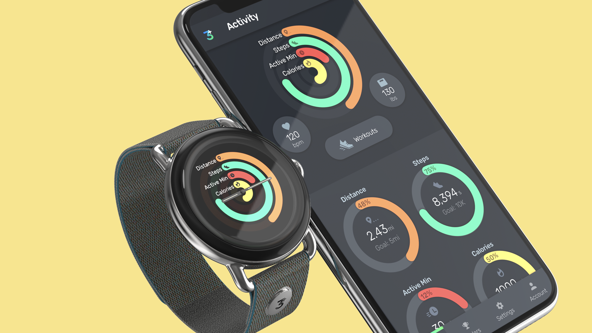
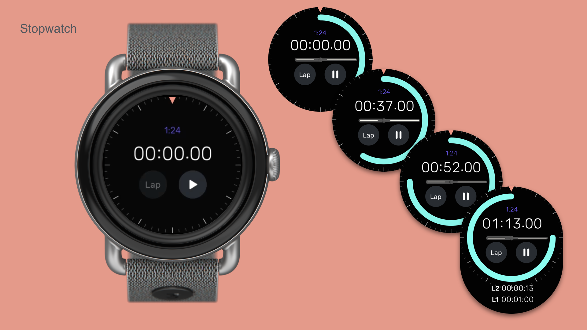
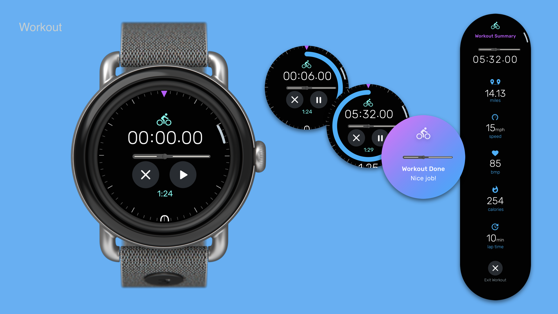
Respecting the inherent cyclical nature of time, we chose the circle as our primary design theme for bothe the ID and the UI. The circle is a comforting symbol of continuity and renewal, a theme we hoped to instill throughout the user experience.

CONCEPTING
Focusing on the theme of time as a continuous loop, we generated several concept directions which were later selected down based on defined criteria.

To maximize perceived display area and minimize watch body size proportionally, we created a black bezel and used a black background on all screens. This allowed the eye to see the bezel and display as one continuous black background.
Despite technical hurdles, we were able to develop a one piece crown able to function as a dial and a button while still maintaining target thickness and a 5 atmosphere waterproof rating


A new requirement of wireless charging was added midway through the design process. The original stainless steel watch back would block the inductive charging coil. We were able to respond quickly and modify the design to accommodate a ceramic back.
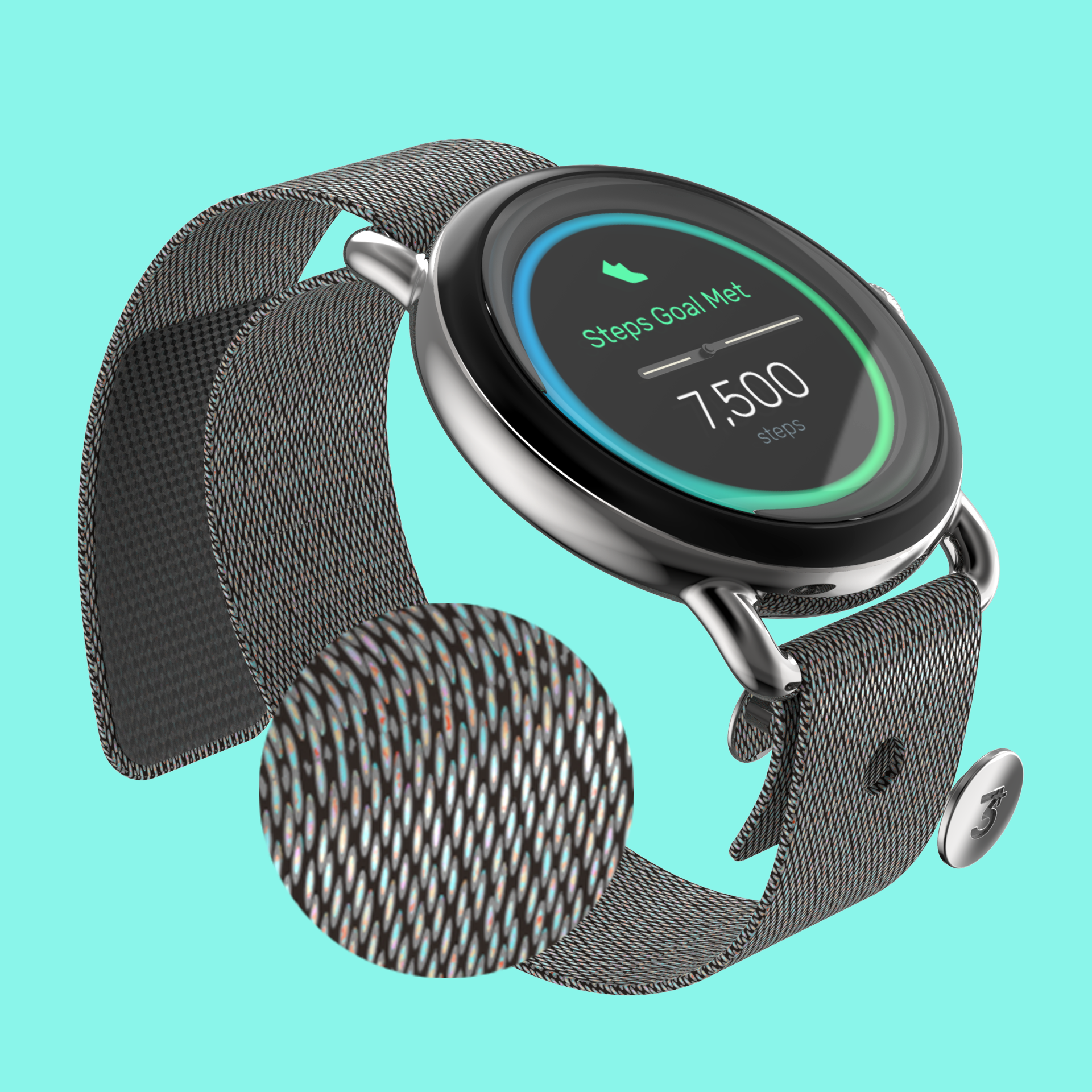
The watch will ship with one watch band. So we designed a band that was appropriate for all occasions. Our strategy was to weave a nylon band with individual fibers matching our UI palette. From a distance it's silver. From close up its a colorful combination of the teal pink yellow and cerulean blue used through out the interface.


We maintained our circular theme through out the package as well.